

Reframing one of Portugal’s most historic medical schools through a contemporary identity that connects two centuries of academic heritage with a more open, dynamic and human vision of medicine.
Brand identity
At its centre, a dynamic “M” that changes and adapts across contexts, connecting two centuries of academic heritage with a contemporary vision of medicine.
Living logo
Like a living organism, the M moves, divides and transforms, so the brand is never quite the same twice.
Colour & cellular system
The M extends into a flexible cellular system that brings movement, colour and coherence to the entire brand ecosystem.
Communication & applications
From campaigns and wayfinding to merchandise, every touchpoint expresses a more open, dynamic and human vision of medicine.
FMUL
Made of a different matter.
Next project
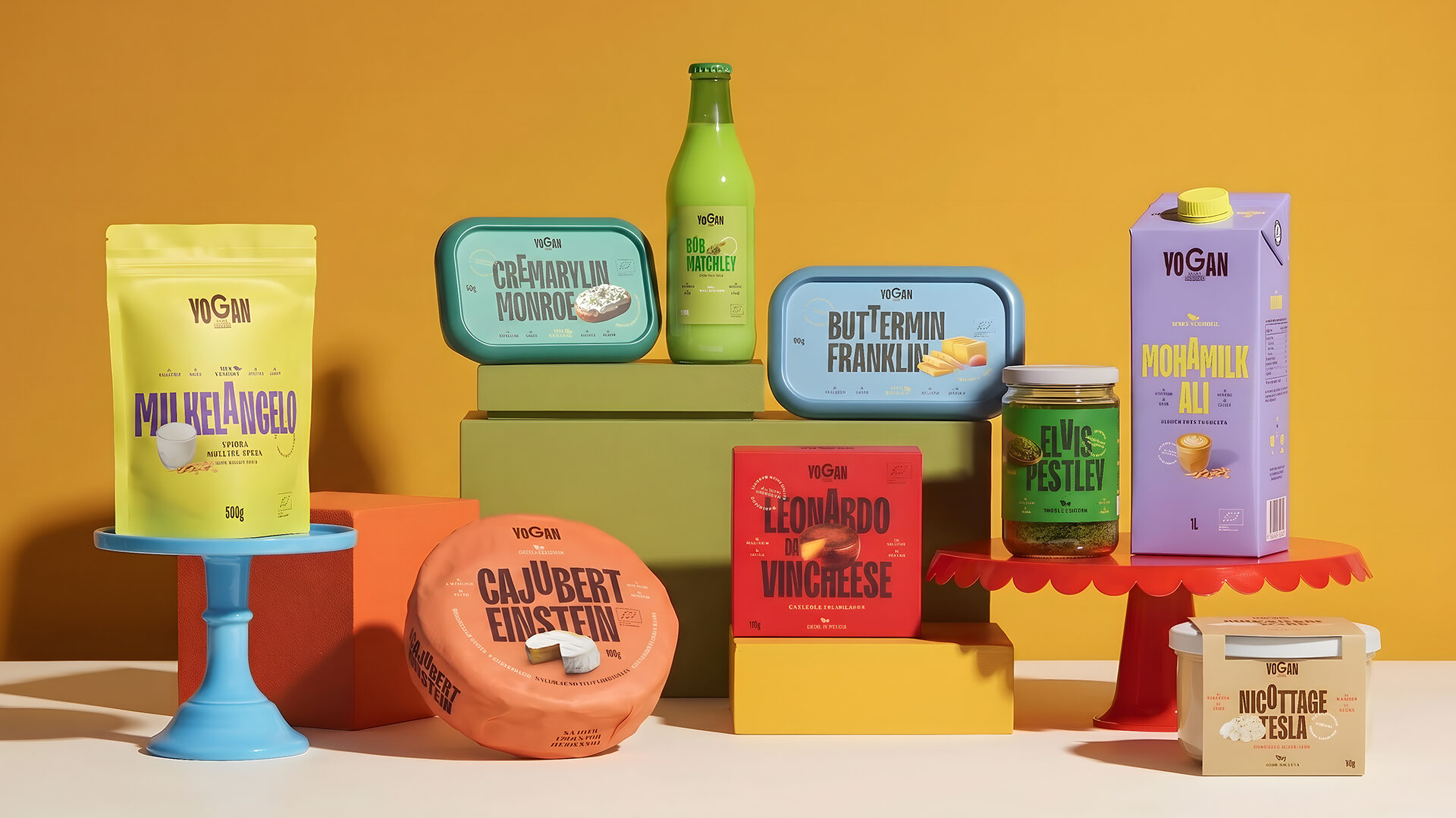
Yogan
Don’t follow the herd.
Have a project in mind?
Let's make it human.